| Milton Glaser | |
|
Selected Objects |
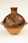
China, Gansu or Qinghai Province
Neolithic period, Gansu Yangshao culture, Banshan type, about 3rd-2nd millennium B.C.E.
Earthenware painted with red and black slips
H. 15 5/8 in. (39.7 cm), D. 13 1/4 in. (34.9 cm) without handles; 1979.125
When we see objects of such primal power and expressiveness, we are forced to question any notion that art improves in quality as we progress historically. Quite the contrary, this dynamic prehistoric storage jar puts most of the ceramics created in our time to shame.
The painting of the swirling forms at the top of the jar are executed with a virtuosos skill and daring. Although there is a functional reason for the bottom of the vessel to be left unpainted, the compression and activity at the top is enhanced by the contrast of the unadorned base. In a time of technological obsession, this piece reminds us of the fact that astonishing objects can be created out of the most fundamental means. Clay, water, fire, and the human imagination.


Dish
China, Jiangxi Province
Ming period, Hongzhi era, 1488-1505
Porcelain with overglaze yellow enamel (Jingdezhen ware)
H. 1 3/4 in. (4.4 cm), D. 8 1/2 in. (21.6 cm); 1979.179
Dish
China, Jiangxi Province
Ming period, Zhengde era, 1506-1521
Porcelain with overglaze yellow enamel (Jingdezhen ware)
H. 1 3/4 in. (4.4 cm), D. 8 5/8 in. (21.9 cm); 1979.180
One could scarcely imagine a more reductive solution to the task of creating a bowl for ritual use. It is instructive to look at these two beautiful bowls together to realize how the smallest variations can produce significantly different effects. The brighter canary yellow of the later piece is infectiously cheerful compared to the more somber note that the earlier vessel creates. After you study the two bowls for a while the thinner body of the earlier piece begins to make the later one seem coarse. There is also the slightest difference in the height of the foot ring, the Hongzhi piece being slightly higher. It would be fascinating to observe which bowl was generally preferred. Would the bright yellow and thicker lip create a cheerful effect that most people prefer or would the more withdrawn and elegant earlier bowl prove to be more popular? Does the question depend on the sophistication of the audience? In this case, what do we mean by sophistication? The great subject of human aesthetic preference comes into play here. One recalls the Renaissance argument about the conflict of form and color. As for myself, I'd take home the bright yellow bowl.
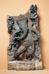
India, Uttar Pradesh
8th century
Sandstone
H. 49 1/2 in. (125.7 cm); 1979.13
This playful depiction
of Ganesha charms us immediately. The sense of motion reminds us of a
futurist painting or a stroboscopic photograph of a figure in motion.
This sense of movement is rarely attempted in sculpture but here it is
the defining characteristic of the piece. This might be called "Ganesha
Swings." Cubism, the movies, and photography have all changed the way
we perceive time in relationship to imagery. For us it's more natural
to read this sculpture as a series of moving forms rather than a creature
with ten arms. The combination of naturalistic observation and knowing
stylization is impressive. For instance, Ganesha's stomach demonstrates
that the sculptor really understands anatomy very well but has abstracted
the forms to produce a more harmonious effect.

North China
Northern Song period, 12th century
Stoneware with sgrafitto design in slip under glaze (Cizhou ware, probably from Xiuwu or Cizhou)
H. 12 1/2 in. (31.8 cm), D. 8 1/2 in. (21.6 cm); 1979.141
Most decoration applied to ceramic objects is generally conceived in two dimensions. In this remarkable vase the surface design echoes the total three dimensional form of the object from any angle including top down. The decorative treatment amplifies the physical attributes of the vase. As the surface is rotated an amazingly varied panorama emerges. The boldness and confidence of the design is enhanced by the energetic arid expressive line that is a consequence of scratching through the layers of color. The resistance of the surface produces a completely different effect than a painted line. The surface of the vase is more like the leathery skin of some unknown animal than the customary smooth and reflective surface that characterizes most glazed pottery. Although, at first glance the vase appears to be black and white, closer scrutiny reveals that it is made of two colors that simply have no name.